|
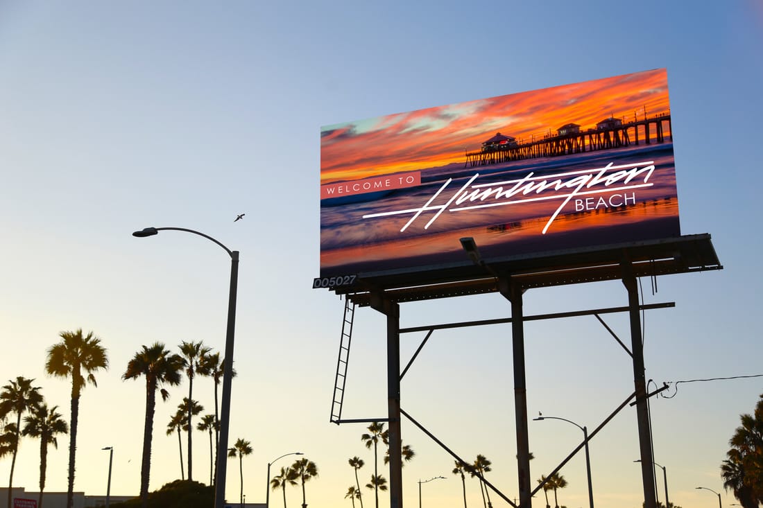
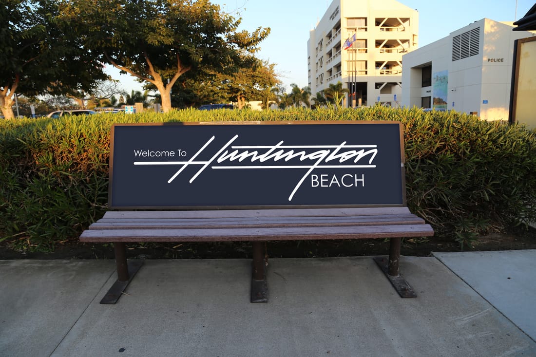
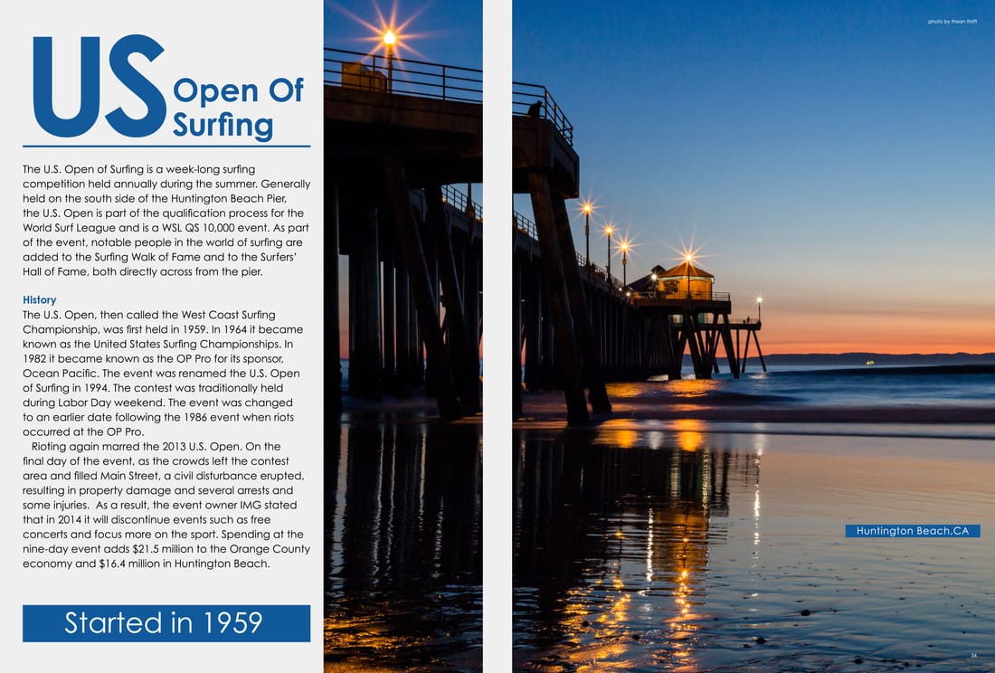
Huntington Beach,CA
My grandparents and most of all my friends live in Huntington Beach. The past few years I’ve noticed a lot of people coming to see the city. More and more tourists started coming around. Huntington Beach recently finished a shopping center called Pacific City that is 191,000 square feet. They also built 2 new apartment complexes in another shopping center called Bella Terra. To me, Huntington Beach is becoming a destination for tourist to come and visit or to even live in. So since the city is growing rapidly and constantly adding new living areas for residents, I’ve decide to create something beautiful for the visitors to see. Type: Joseph Means Tools: Pencil & Paper, Illustrator, Photoshop Photography: Theon Thrift |
|
|
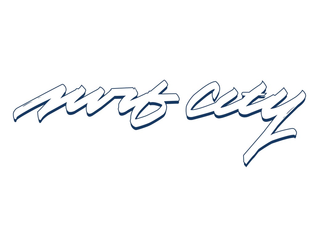
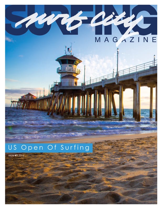
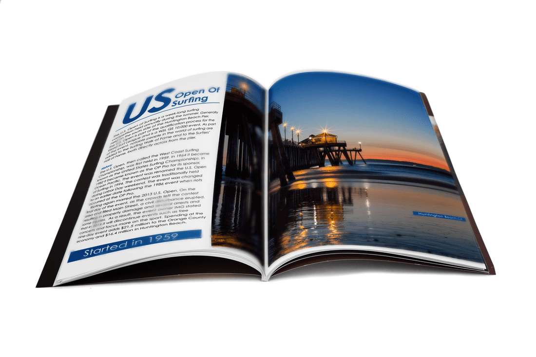
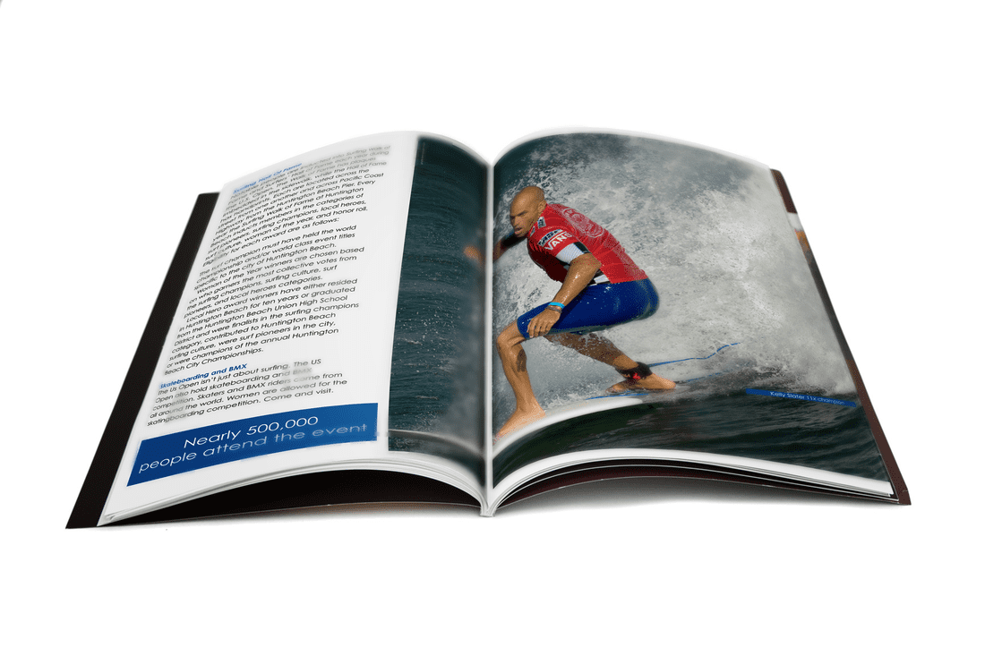
US Open Surf City
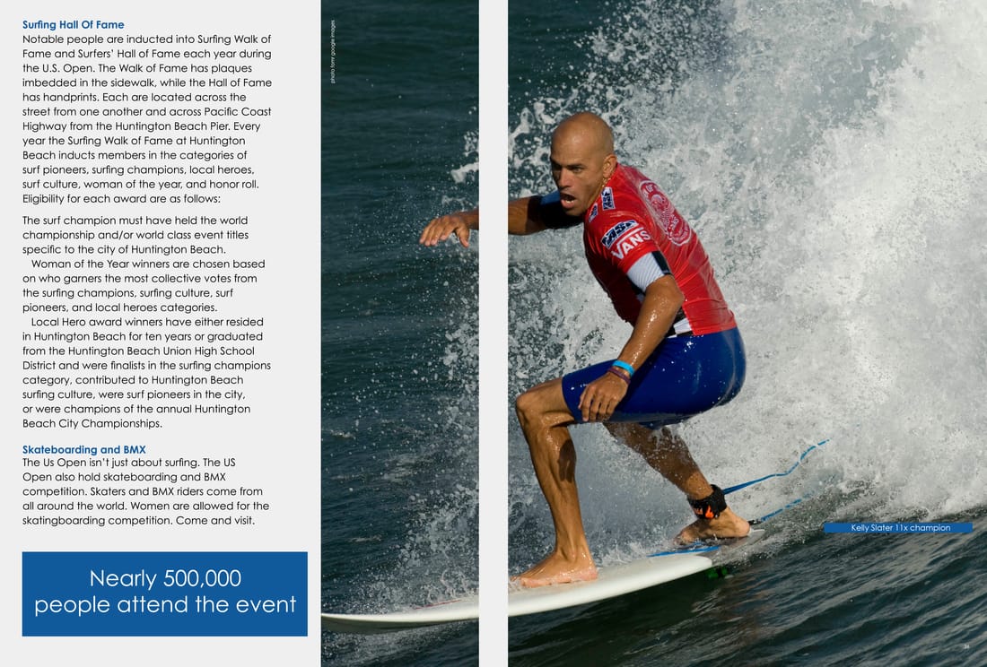
The US Open is a big event that happens every year in Huntington Beach. People from all over the world come to see the event. The event nearly has 500,000 people there. It is held for one week, usually they have the event towards the end of July. At the US Open there isn’t just surfing competition, they also have skateboarding and bmx. I created a two page spread and cover, talking about the US Open. The typography and two of the photos are original. Typography: Joseph Means Photography: Theon Thrift, Google Tools: Illustrator and InDesign |
|
|
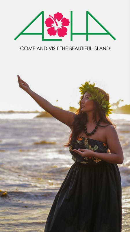
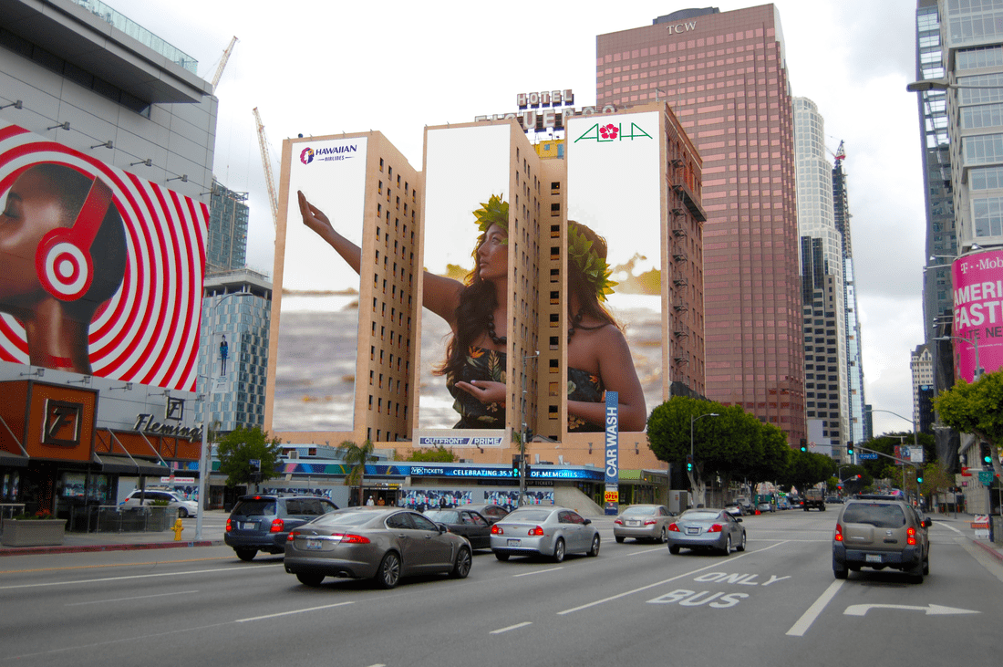
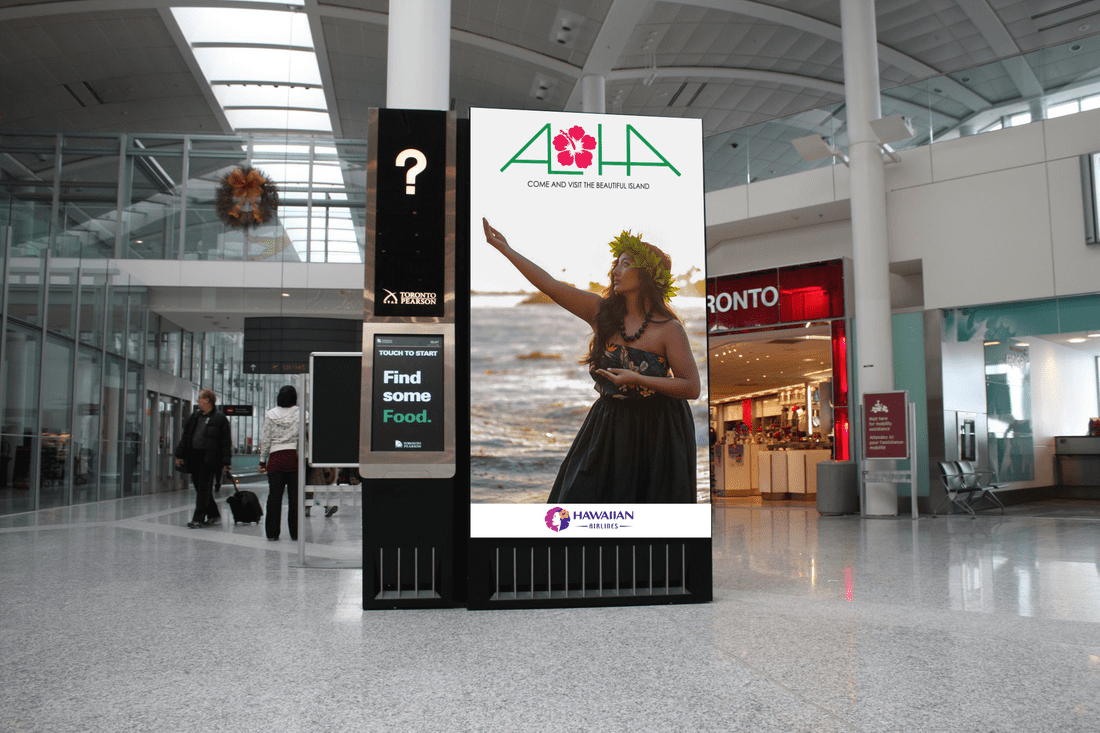
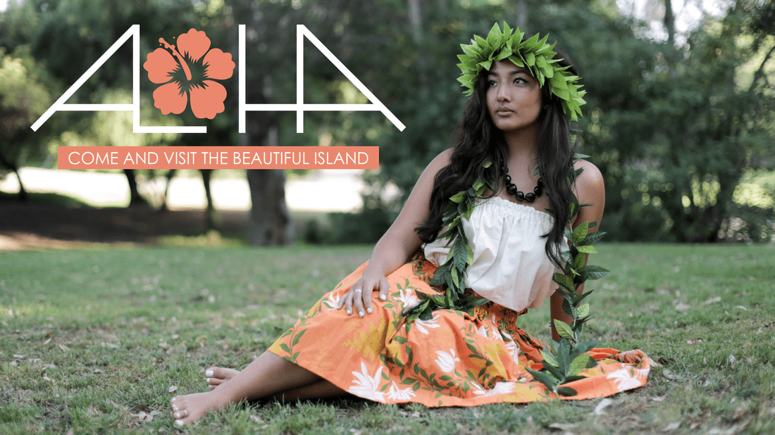
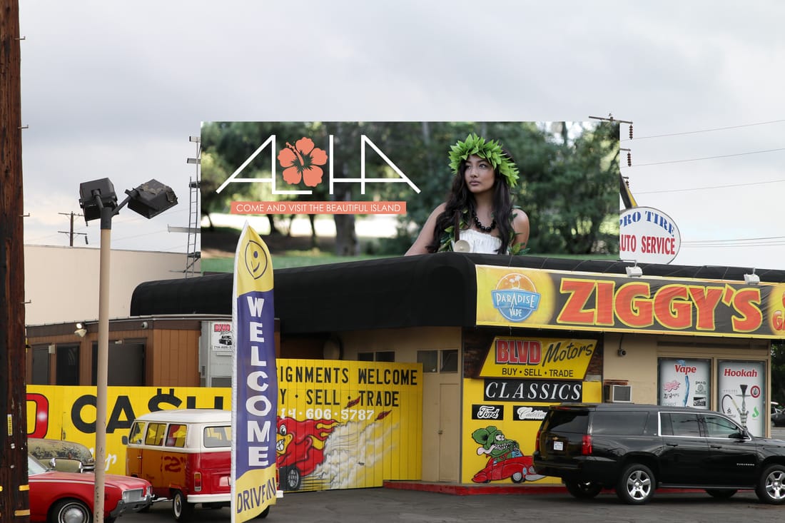
Beautiful Island of Aloha
Hawaii is a beautiful place to visit. I think everyone should visit the island once in their life. I decided to create something so people want to visit the island along with learning about the culture. Being a part of the Pacific Islander race, it means a lot more to me to create something in my culture. Instead of using a model and having them dress up as a hula girl, I used my sister for the project. Since I wasn’t on the island to use the landscape with the model, I went somewhere that would look similar to Hawaii. I went to a park that would look like the jungle and a nice beach in Laguna Beach. I wanted to use the O as a hibiscus flower because its the states flower. Type: Joseph Means Photography: Kim Chung, Joseph Means, Google Model: Jessica Quenga Tools: Pencil, Illustrator and Photoshop |
|
|
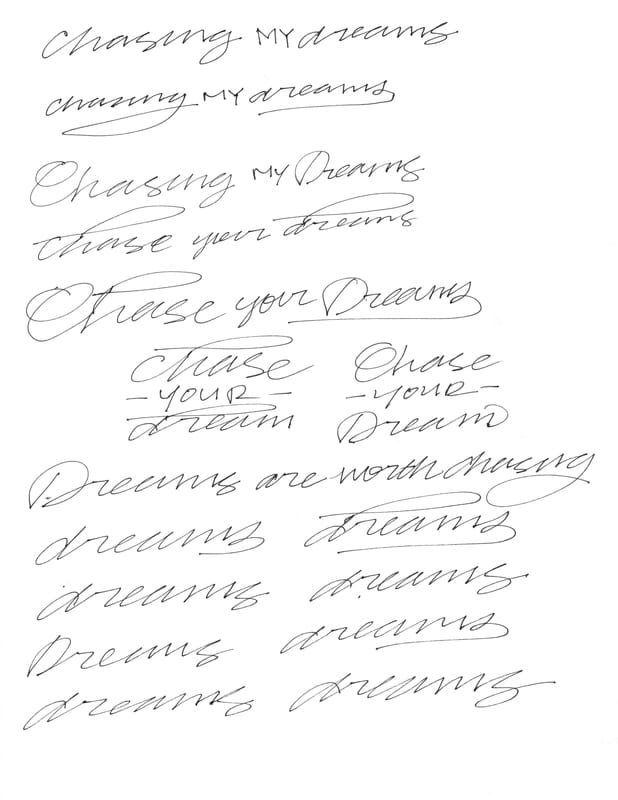
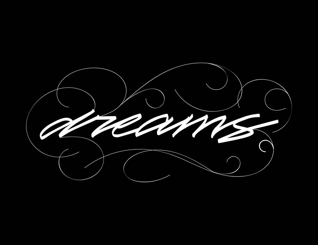
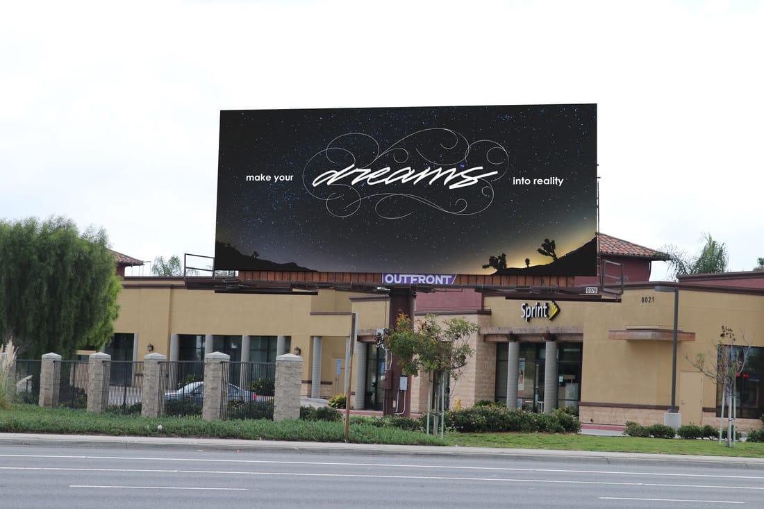
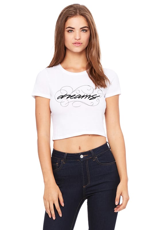
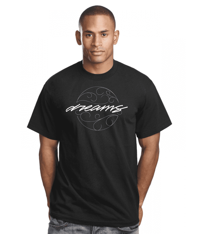
Dreams Into Reality
I decided to do something different on this project. Instead of selling something or trying to get people to go somewhere, I wanted to encourage more people out there to go out and chase their dreams. Becoming a designer / artist wasn’t always a dream for me but now it has become one. I want to become one of the best out there. I believe we shouldn’t settle for less or just be comfortable. One thing we all have to learn though, is we always have to be willing to make sacrifices and be willing to put the time in. You should never think your dream will come to you because it wont. You have to go out and chase your dream. I used my own type and photo to go along with this project. Type: Joseph Means Photography: Theon Thrift Tools: Sharpie marker, Illustrator, Wabcom Tablet |
|
|
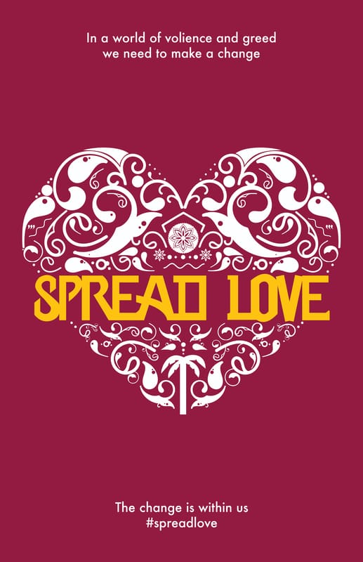
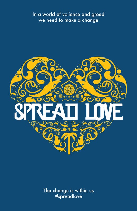
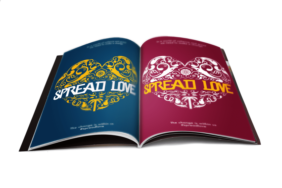
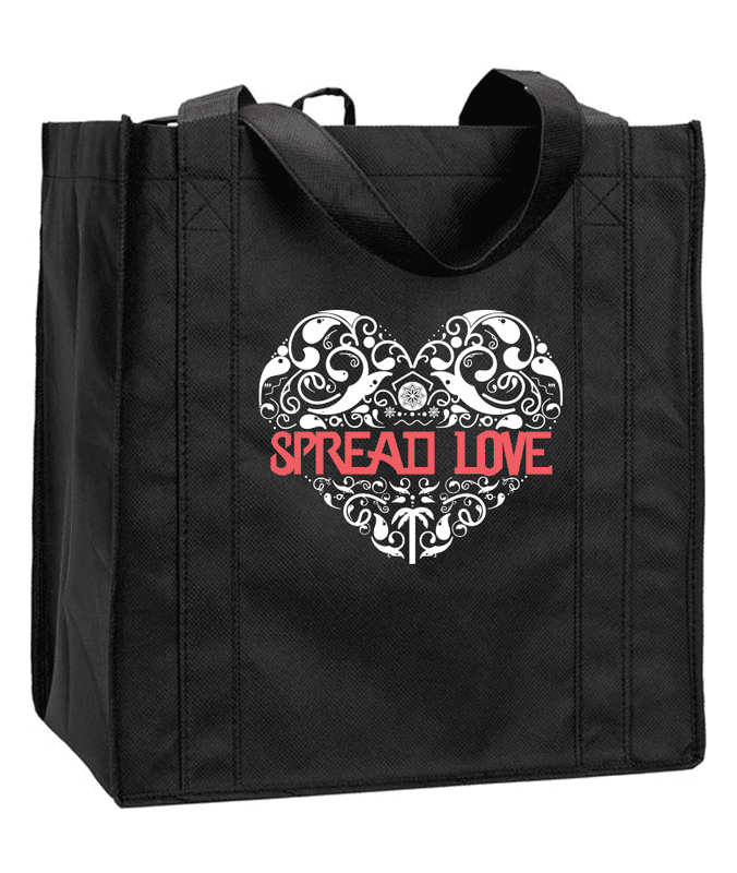
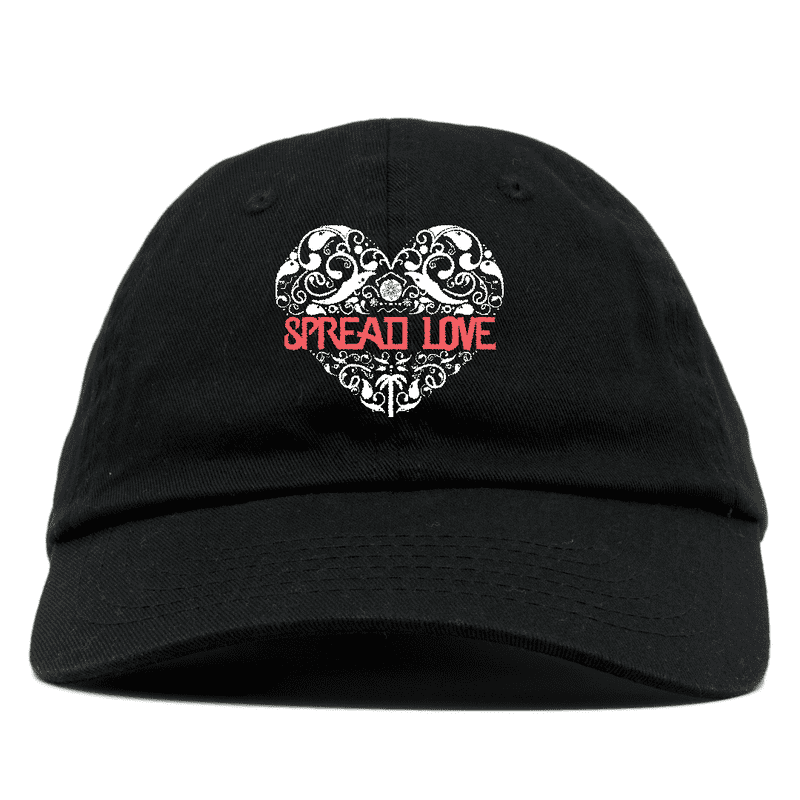
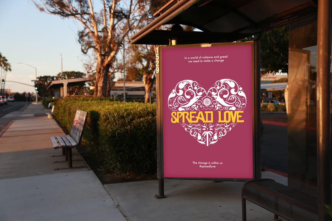
Spread The Love
The way how the world is going we need to make a change. There is a lot of cops killing people or people going on a rampage killing innocent people at movie theaters, etc. I wanted to create something positive because we need more of it in todays world. There is a lot more hate then love in this world in my own opinion. Hate will not solve our problems or make this world a better place to live in. We have become selfish people and only care about ourselves instead of helping others. Instead of creating a regular heart I wanted to something a little different. So I looked at different ways people create their own hearts on Google. This piece is to remind people spread the love. Drawing: Joseph Means Tools: Pencil, Wabcom, Illustrator,Photoshop |
|
|
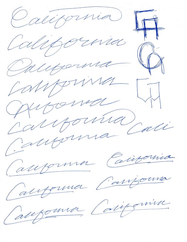
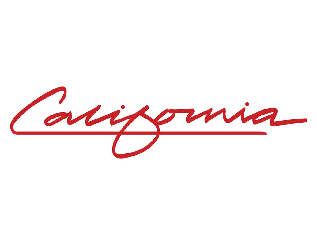
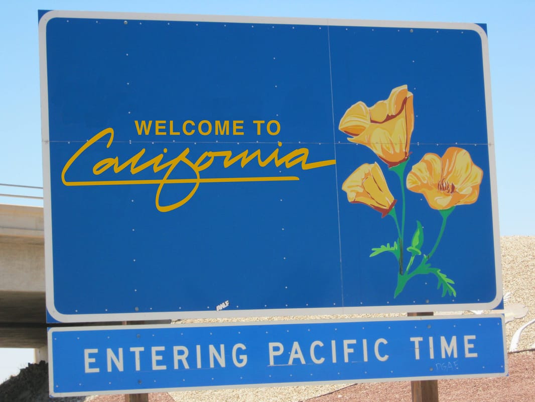
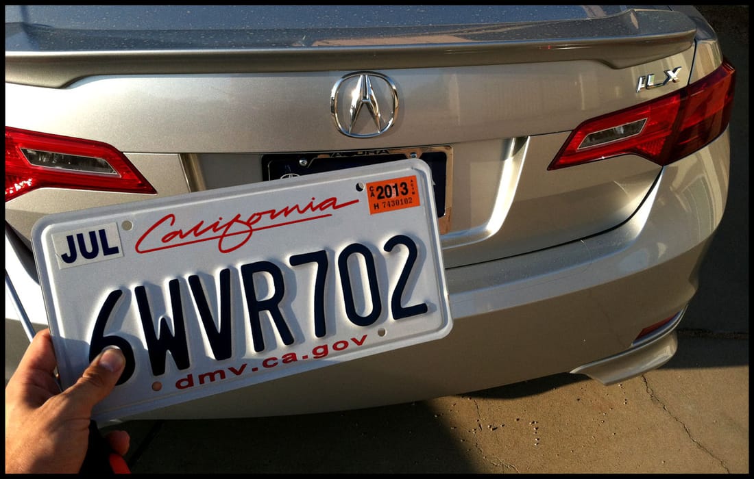
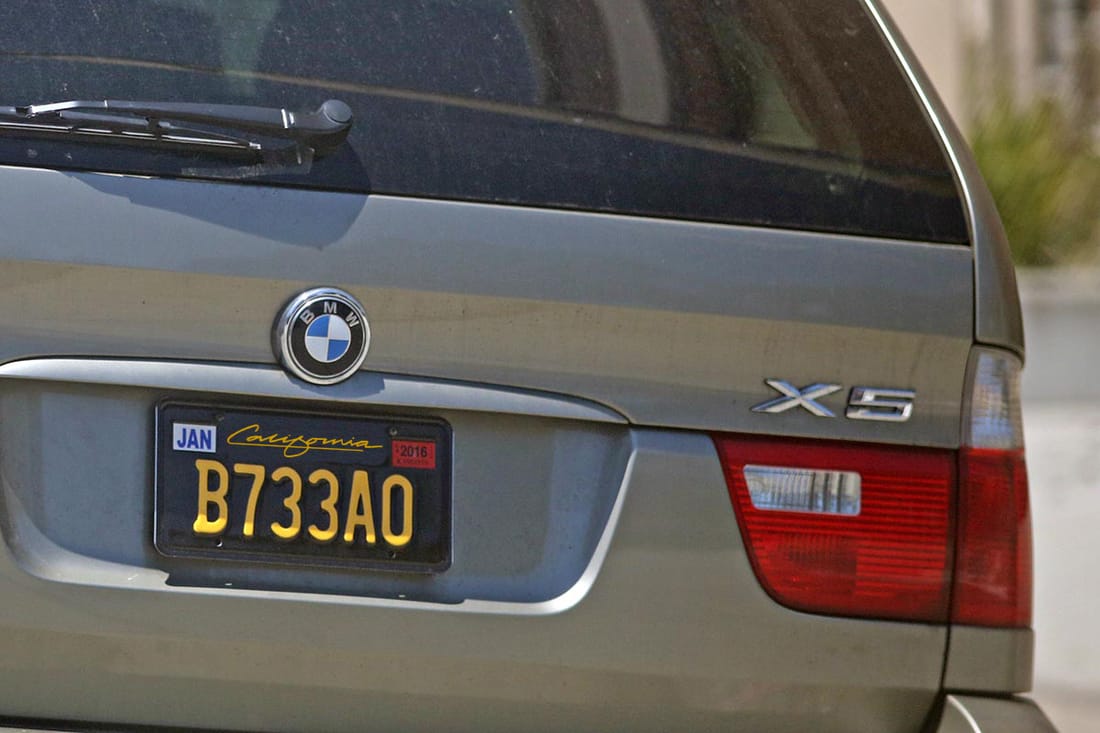
California
The California script was a personal project for myself. I wanted to use my typography on shirts, sweaters, hats, etc. A classmate of mine gave me idea that the type can be used for the California license plate. Since the type they have isn’t that good, this would be a good substitute for the license plate. I also applied the type to the sign that welcomes people to California. Drawing: Joseph Means Tools: Pencil, Illustrator, Photoshop |
|
|
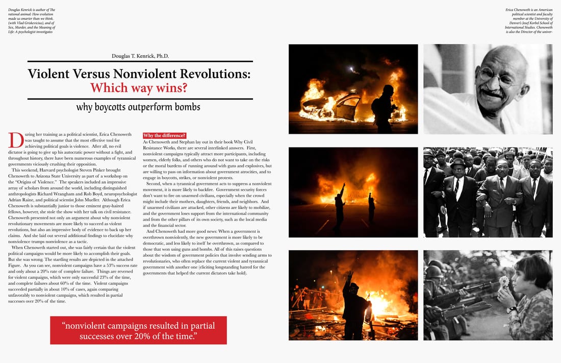
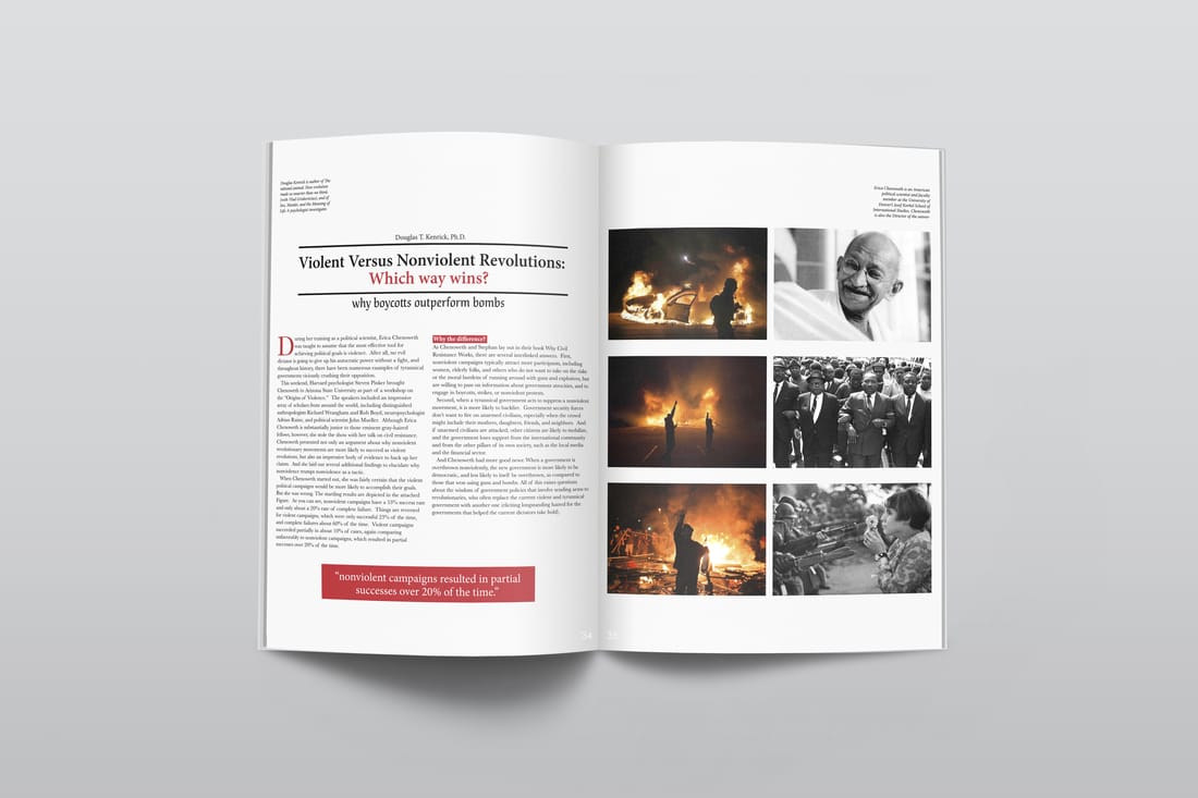
Is Violence The Answer?
Here is a two page spread for a magazine. The spread is created by using a two column gird. I wanted the photos that where violent to be on one side and the peaceful on one side. I made it like look like they were going head to head in a battle. The article is about violent and nonviolent revolutions. So one the peaceful side of the revolution I wanted to use iconic leaders that used nonviolent ways to get their point across. It is a nice and clean spread. This article would be in a Time magazine or Newsweek. Tools: InDesign |
|
|
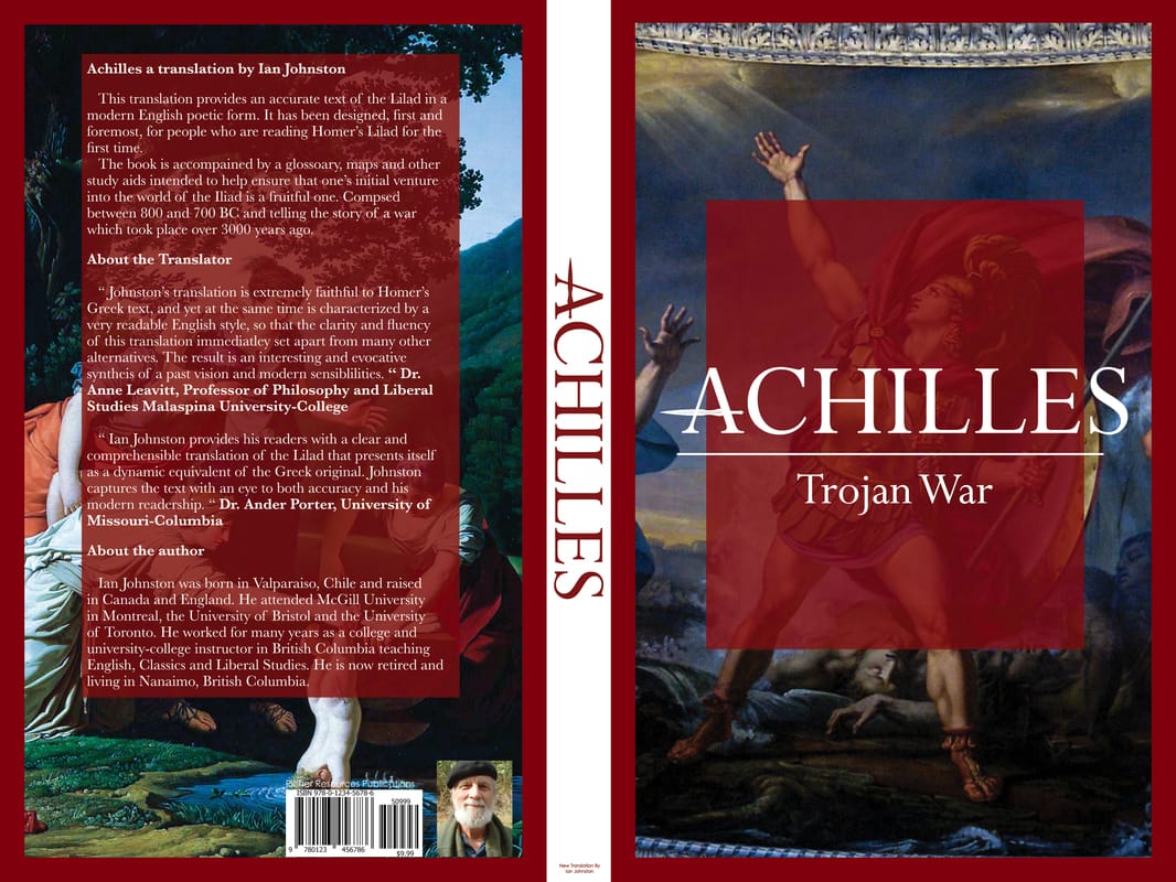
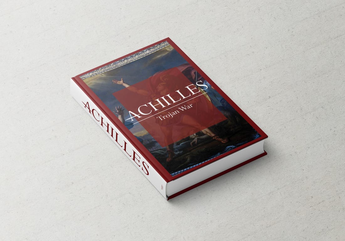
Greek Hero
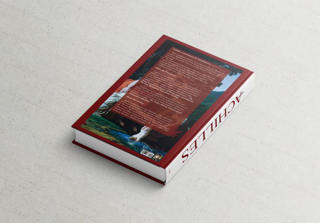
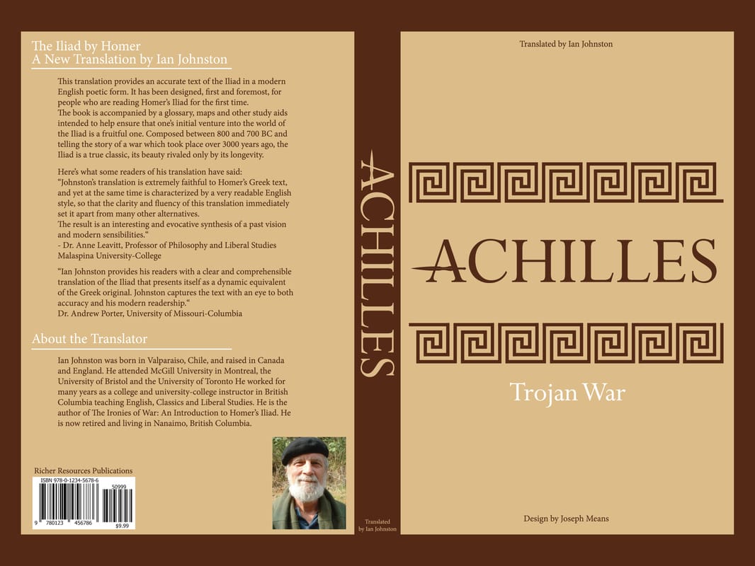
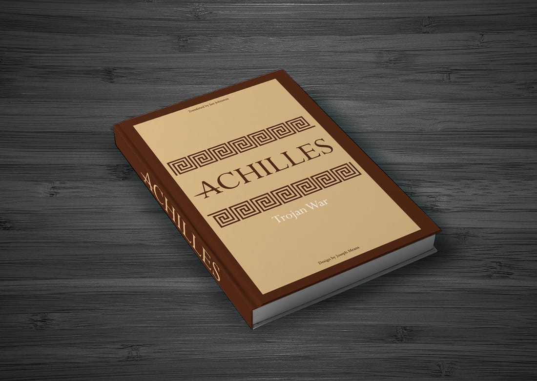
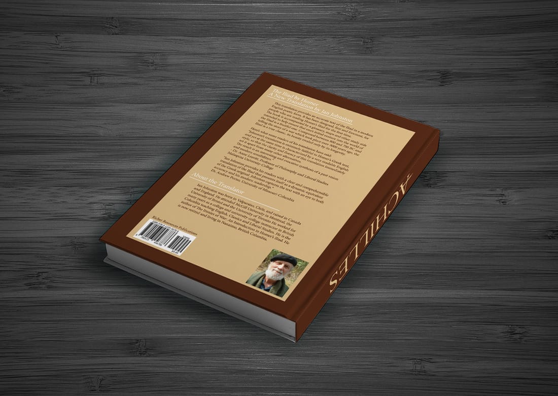
I created two different styles of a book cover called Achilles Trojan War. The first one I designed it with a grid that has 7 columns with 6 rows. This book cover I wanted to use images. The front cover I have Achilles fighting in a war and the back I have him as a baby. Achilles mom was dipping him in the river so he wont die but she forgot to dip his feet in. Hench why they call him Achilles because he died during the war by a poison arrow going through his achilles. The second book cover I wanted to do a very clean and simply design. I used a grid that has 3 columns with 3 rows. I used a well known Greek pattern and different shades of brown. I got the brown from the pottery they did back in those times. Tools: Illustrator and InDesign |
|
|
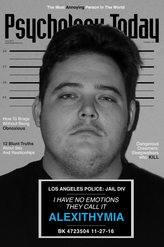
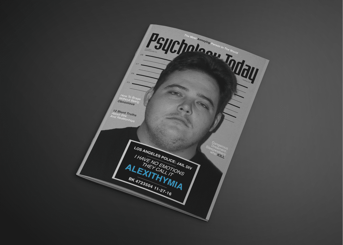
Psychology
For this magazine cover we had to come up with our own topic. I did some looking around to look at what kind of photos they have for their cover and what kind of topics they have already done. First I just started taking pictures of my model. I made him do a bunch of expressions. After the photo shoot was done I started browsing through all the pictures. A few of the photos I was interested but when I came across the photo of my model with a blank face, I immediately thought of it being a mug shot. In my head when you get your mug shot taken you don’t have no expression or feeling at all. So I made the topic about have no feelings. Photography: Joseph Means Tools: InDesign |
|
|
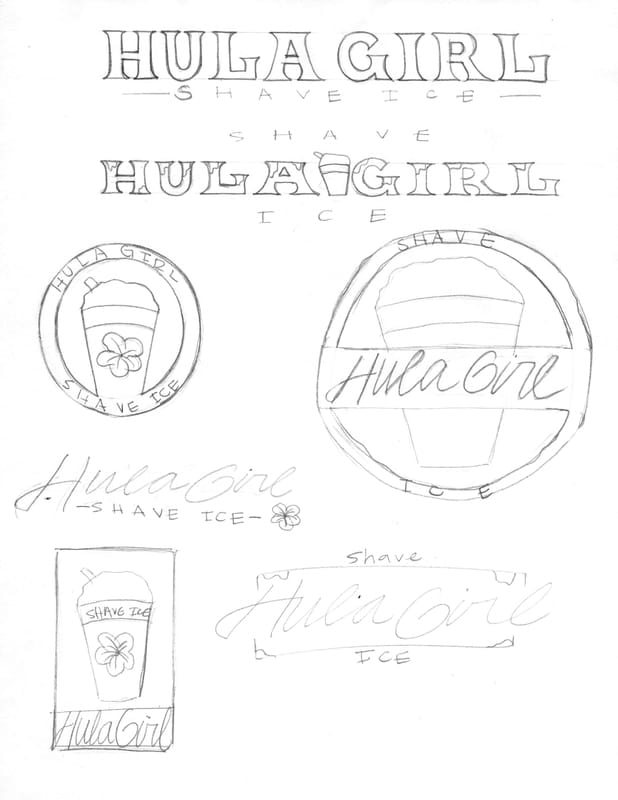
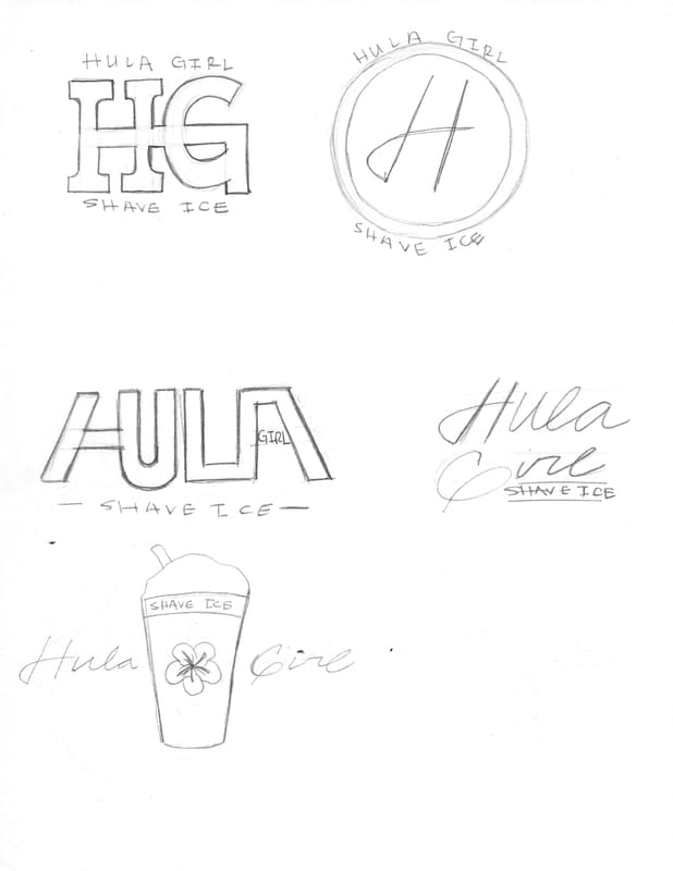
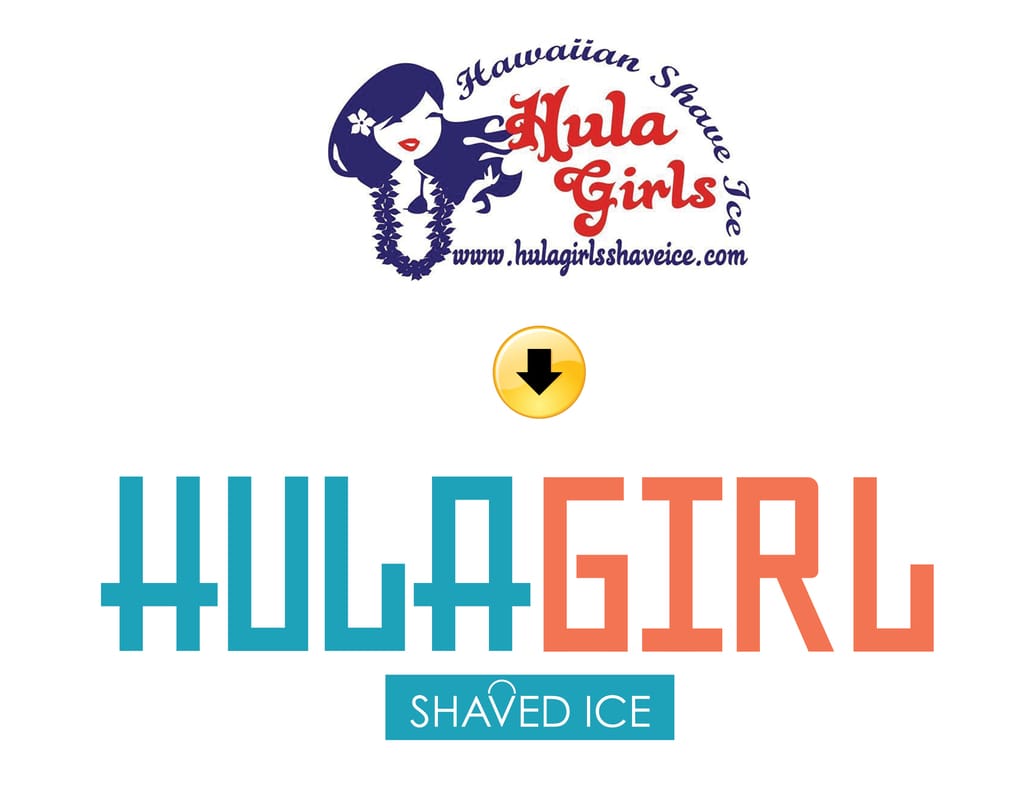
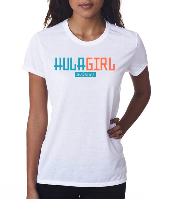
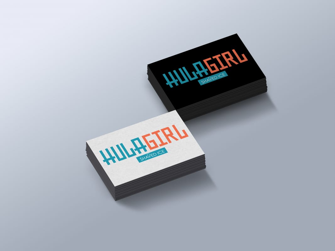
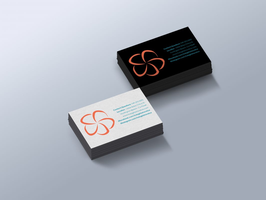
Hula Girl
Hula Girl Shaved Ice is a family owned company. They are located in Huntington Beach. The logo they have is all over the place, they have their website with the logo. I was originally going to go with a script font but as I was working on it I came to realized it should be changed. I decided to change it because the audience will be for the kids. I made the type very bold, easy and fast to read for the kids. I think a script font won’t be as easy to read for some of the kids. The colors I wanted to use were tropical colors. I wanted to keep the island feel to it. The word shaved ice I added a snow cone. Tools: Illustrator and Photoshop Typography: Joseph Means |
|
|
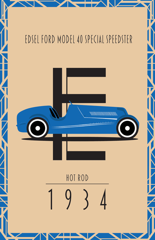
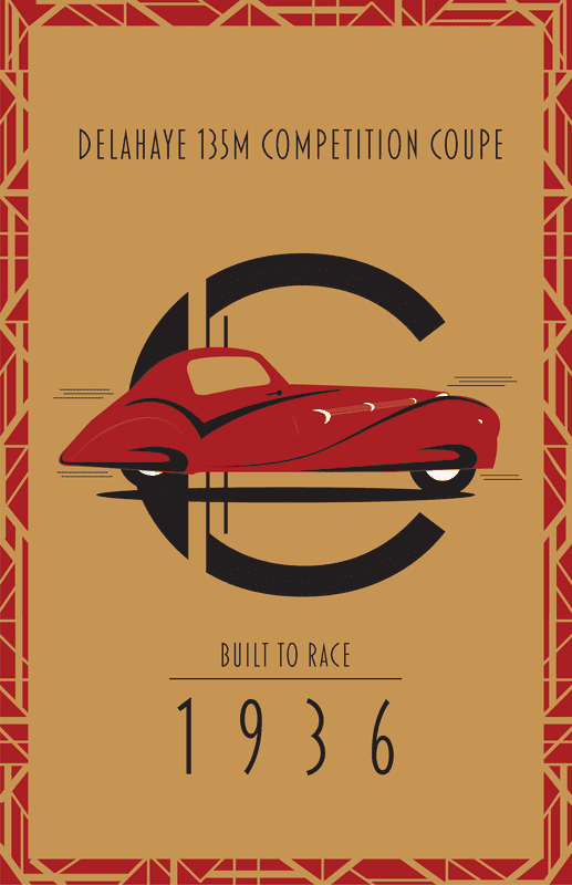
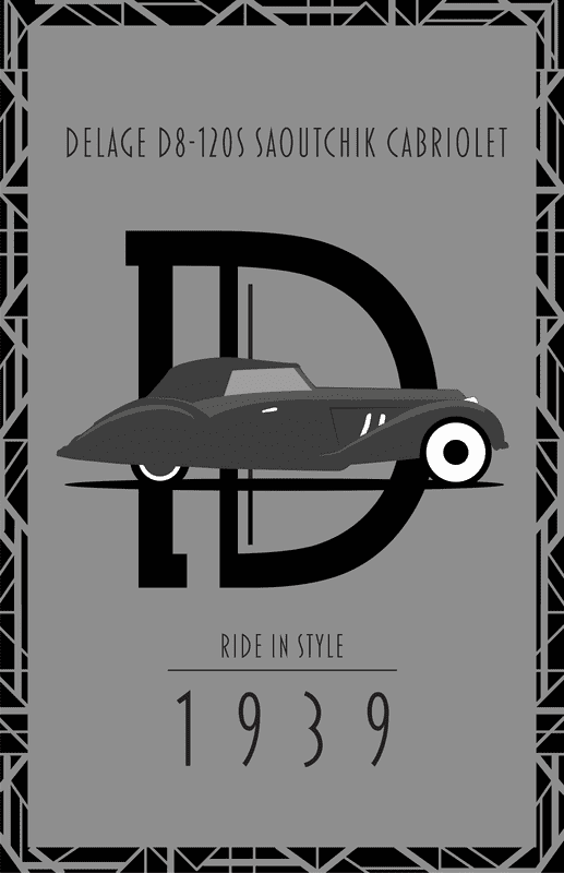
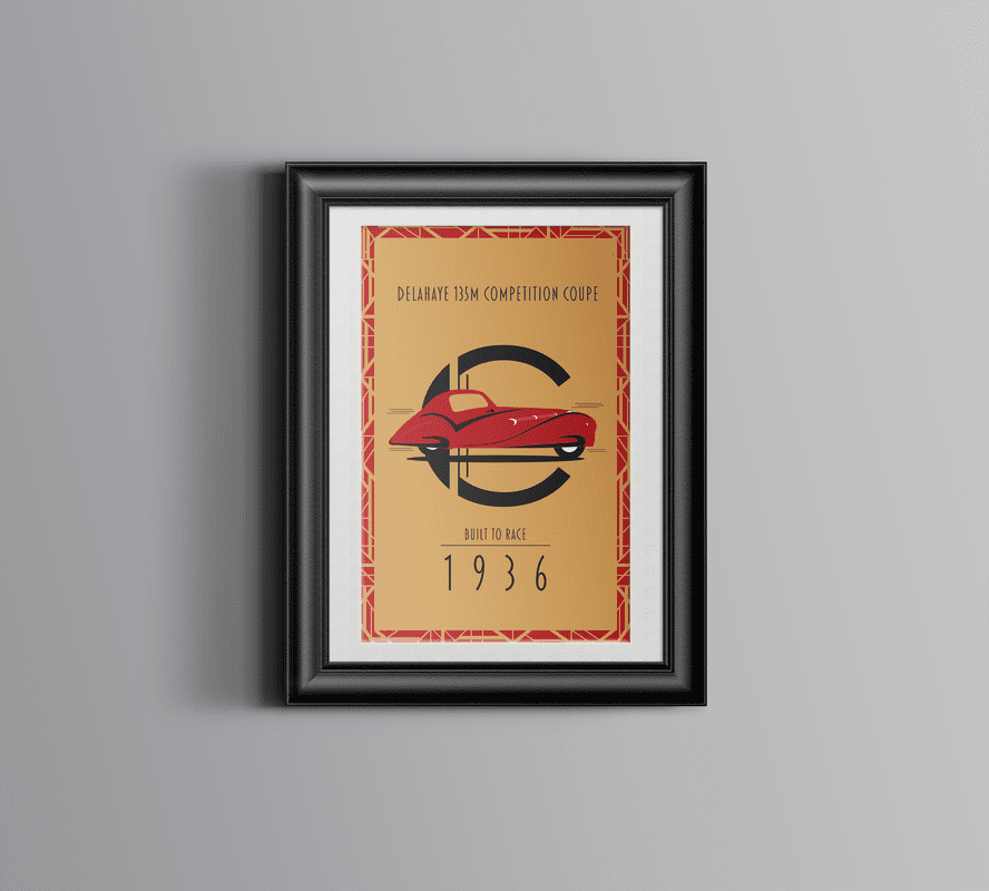
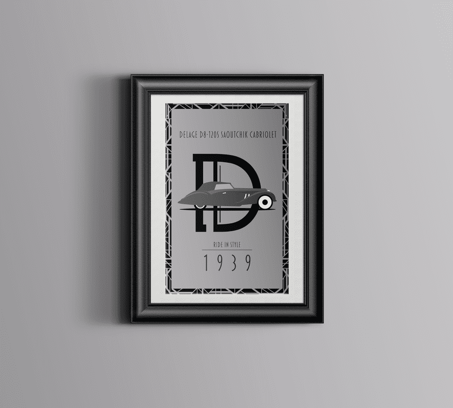
Ride In Style
This project is Art Deco style. I made 3 car posters for a car show that has nothing but classic cars. These posters can be in your house as well, especially for classic car lovers. Each letter behind the car is the name of the car and what year it came out. I designed the typography by hand and I created my own pattern that is Art Deco style. I also gave a little description of what the car would be used for. Tools: Illustrator, Pencil Typography: Joseph Means |
|